数据类型 Data types
1. Numerical data
- Continuous data连续数据: can take on any numerical value in a specified range of values.
- 上海的摄氏温度
- 中国男人的体重
- Continuous data is often represented using histograms and scatterplots. Histograms show the distribution of continuous data, while scatterplots show the relationship between two continuous variables.
- Discrete data 离散数据: result from a counting process
- 一个教室有多少学生
- 一个停车场有多少量车
- Continuous data is often represented using histograms and scatterplots. Histograms show the distribution of continuous data, while scatterplots show the relationship between two continuous variables.
2. Categorical data分类数据
- Nominal data名义数据: are note amenable to being organized in a logical order.
- 比如性别
- 血型
- 职业
- 颜色等;
- Ordinal data: can be logically ordered or ranked
- 比如学生成绩
- 电影评分
- 客户满意度
3. Cross-Sectional versus vs Times Series vs Pannel Data 横截面数据、时间序列数据和面板数据
- Cross-sectional data: 在一个时间点给出总体统一特征变量的观测值;比如给出2023年11月6日美股关于科技板块的一天的回报率;
- Time series: 给出NVDA股票在过去一个月每天的回报率;
- Panel data: a mix of times-series and cross-sectional data; 比如给出所有标普指数中高科技公司过去五年的回报率;
4. Structured vs Unstructured Data
- Structured data: 市场数据、财报分析数据
- Unstructured Data: 新闻、录音、财报earnings
5. Data organization
- One-dimensional array 一维数组
- Two-dimensional rectangular array(data table)
- Frequency distribution 频率分布
- Absolute frequency distribution
- Relative frequency distribution
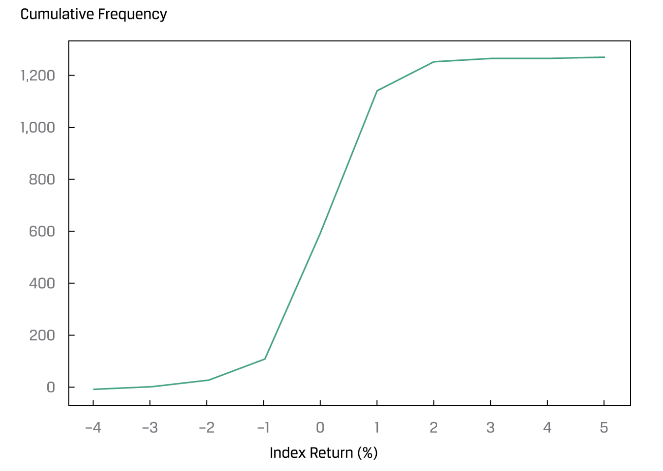
- Cumulative frequency distributon
| Return bin | Absolute Frequency | Relative Frequency (%) | Cumulative Absolute Frequency | Cumulative Relative Frequency(%) |
|---|---|---|---|---|
| 5.0 to 6.0 | 1 | 5.6 | 1 | 5.56 |
| 6.0 to 7.0 | 4 | 22.22 | 5 | 27.78 |
| 7.0 to 8.0 | 6 | 33.33 | 11 | 61.11 |
| 8.0 to 9.0 | 4 | 22.22 | 15 | 83.33 |
| 9.0 to 10.0 | 3 | 16.77 | 18 | 100.00 |
6. Contigency table 列联表,相依表
Data visualizing
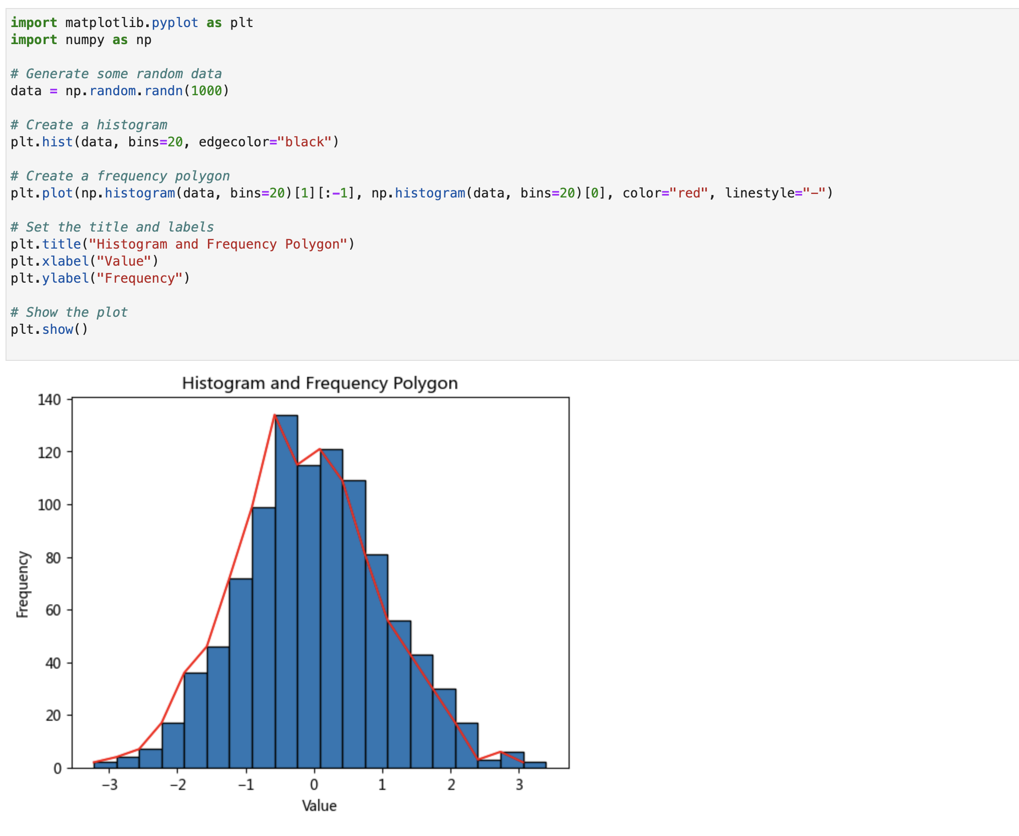
Histogram and Frequency Polygon 直方图和频率多边形
“A histogram is a chart that presents the distribution of numerical data by using the height of a bar or column to represent the absolute frequency of each bin or interval in the distribution.”
Bar chart
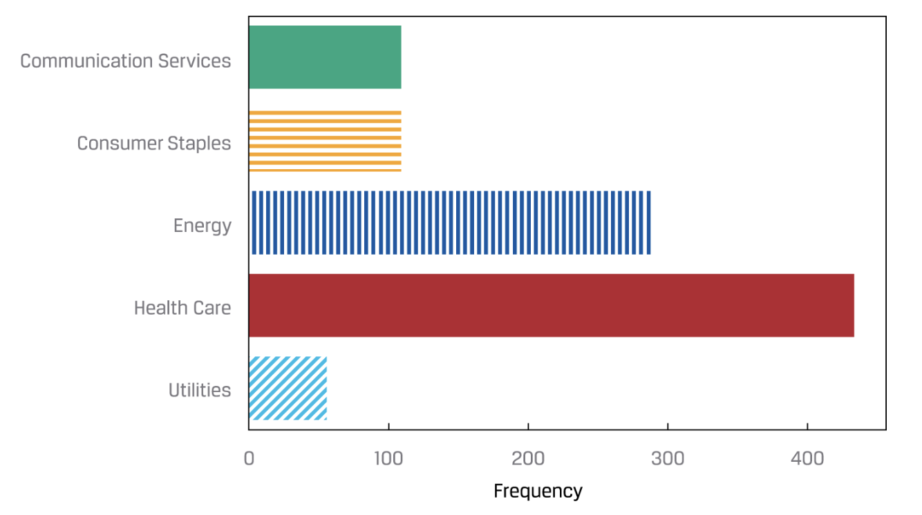
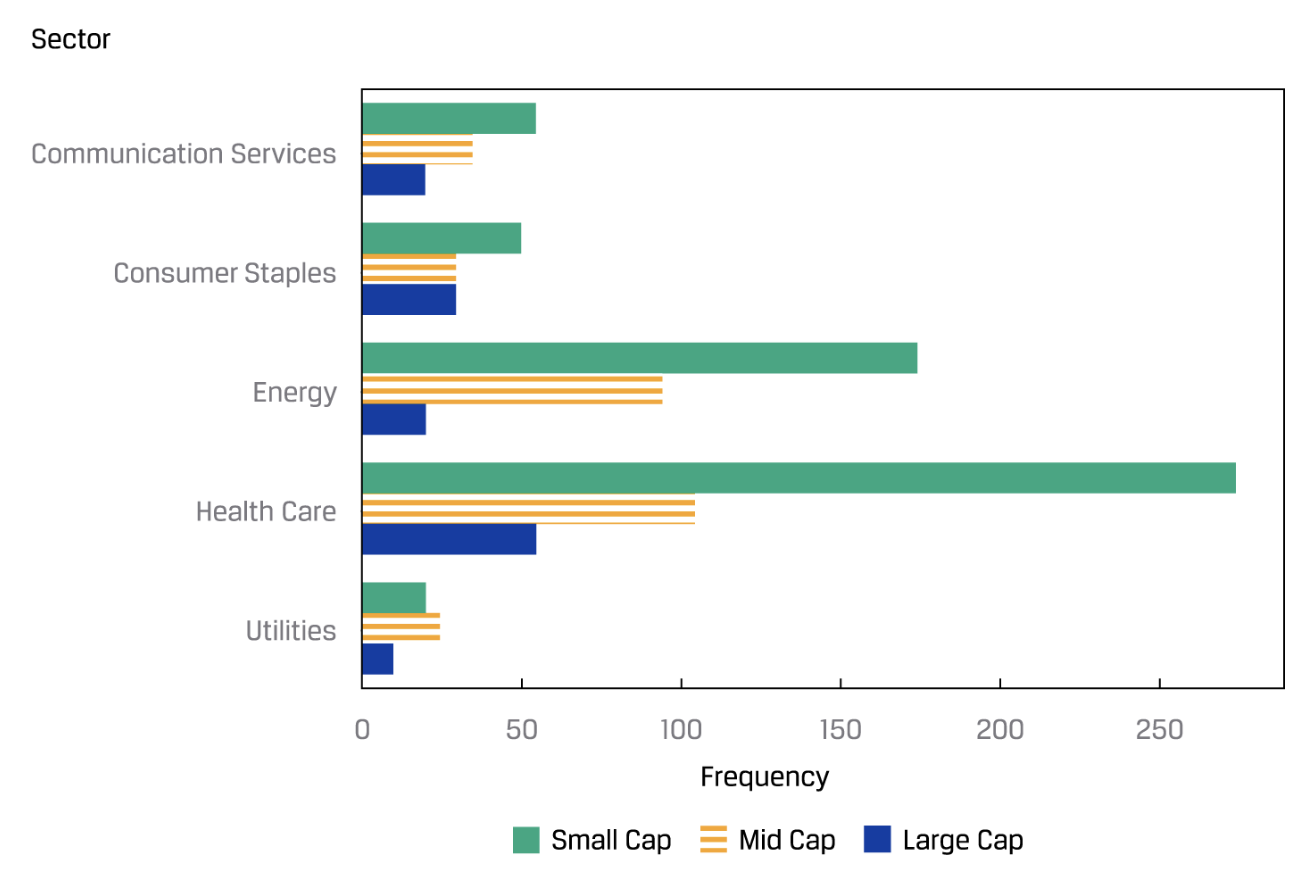
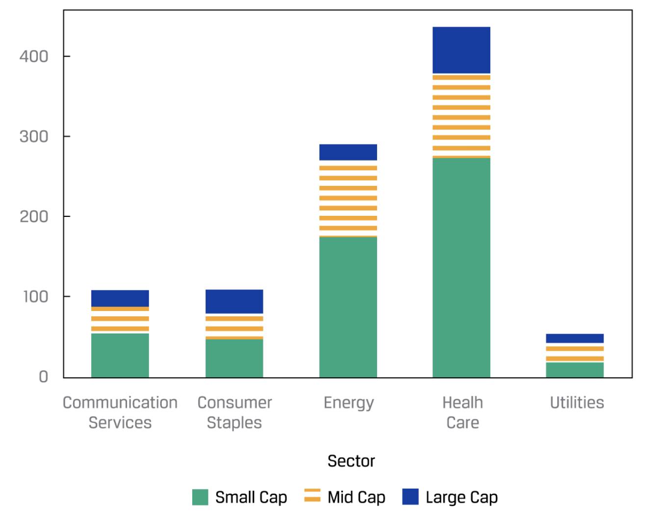
The frequency distribution of categorical data can be plotted in a similar type of graph called a bar chart. In a bar chart, each bar represents a distinct category, with the bar’s height proportional to the frequency of the corresponding category.
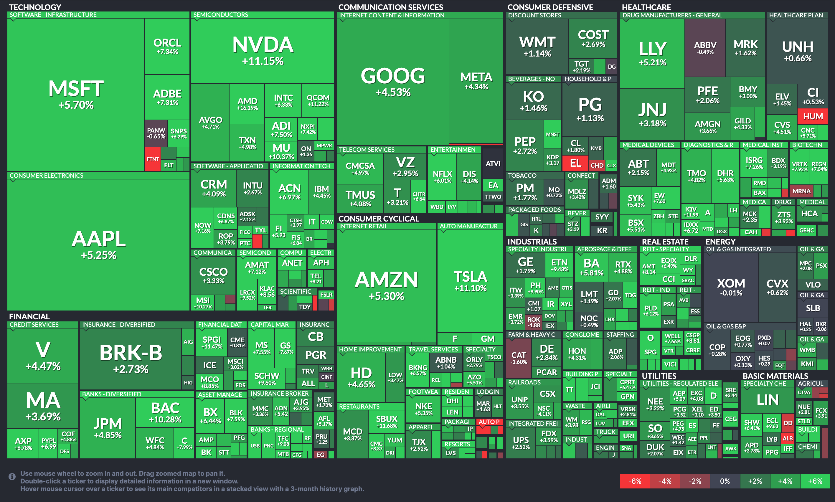
Tree map
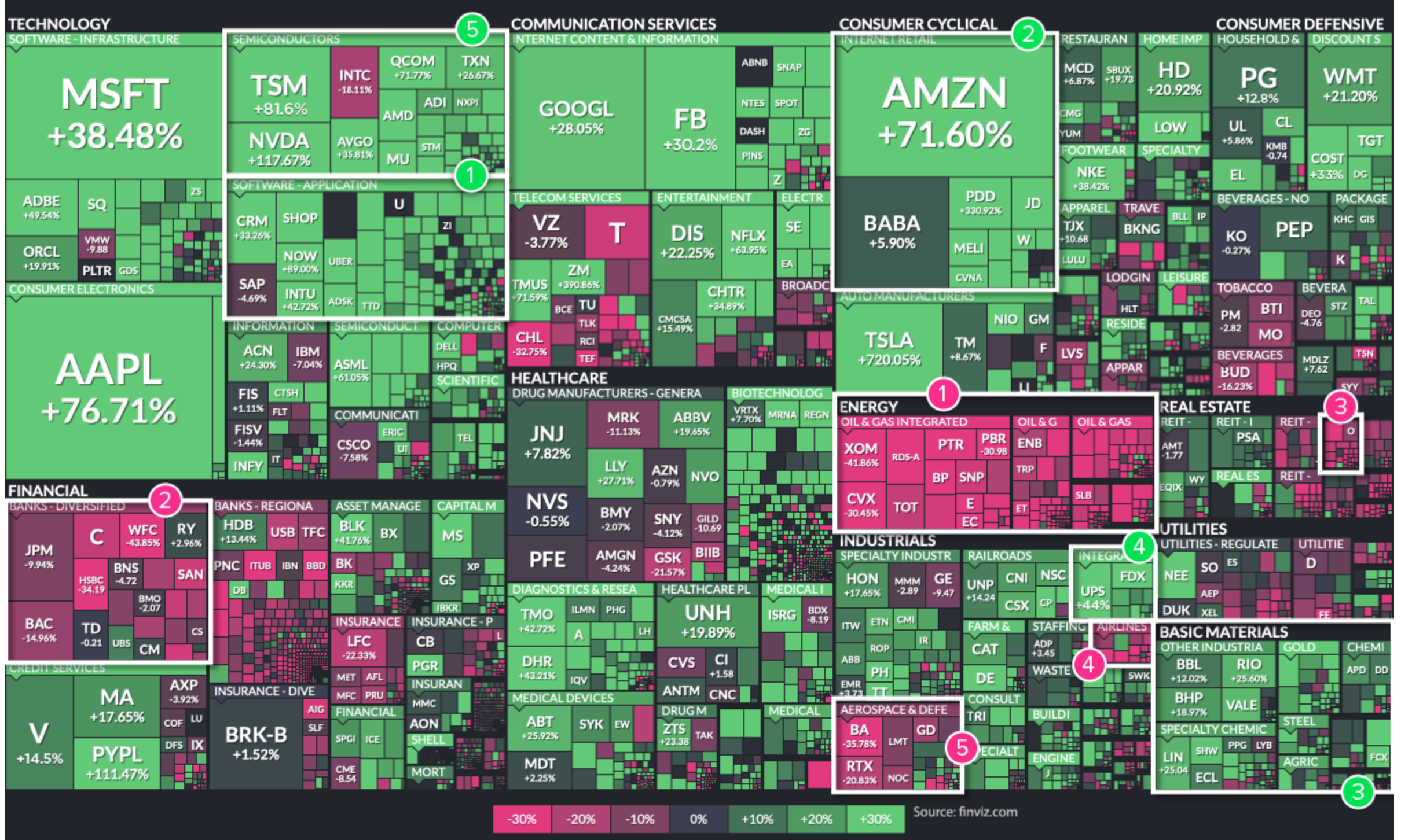
“In addition to bar charts and grouped bar charts, another graphical tool for displaying categorical data is a tree-map. It consists of a set of colored rectangles to represent distinct groups, and **the area of each rectangle is proportional to the value of the corresponding group.**”
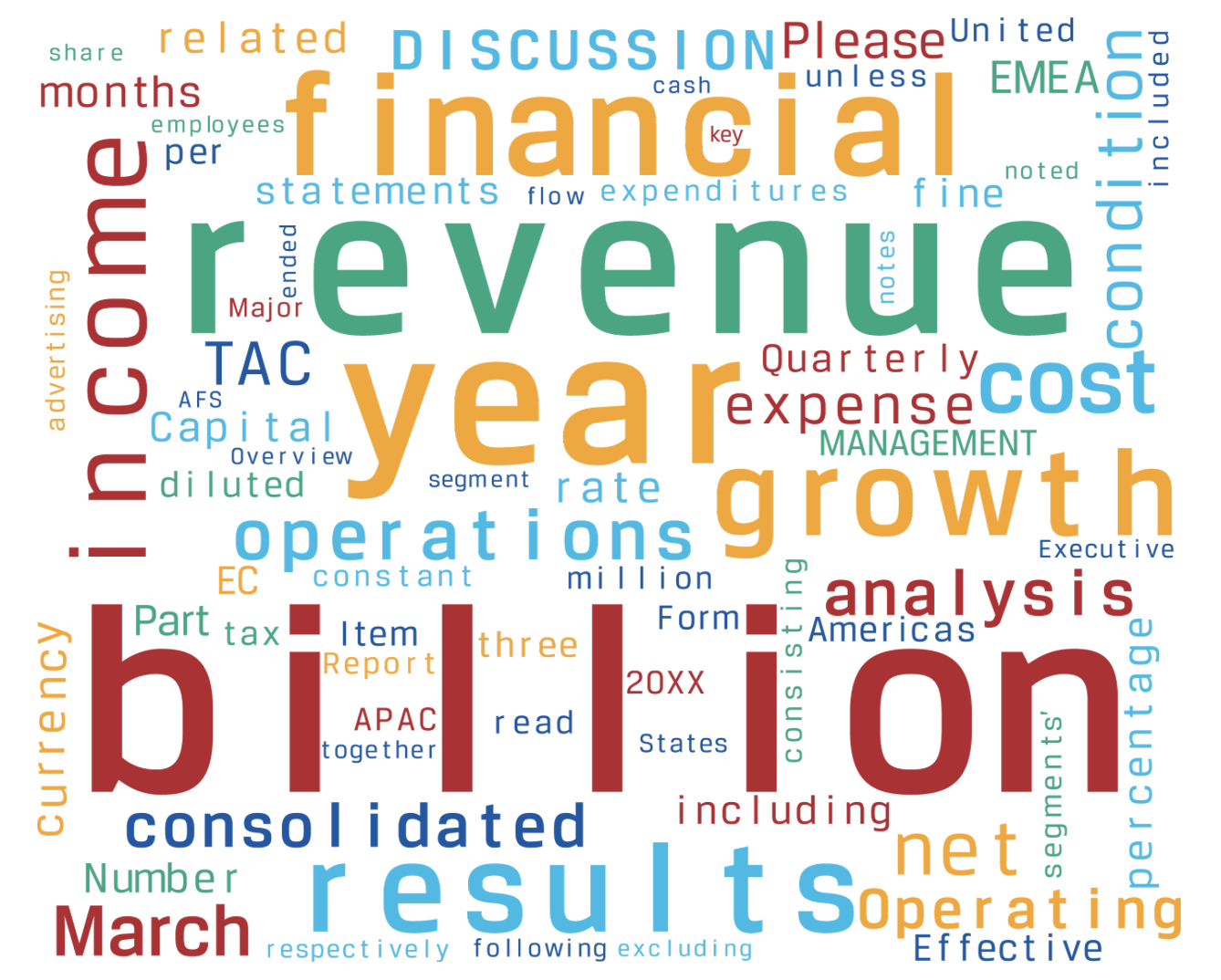
Word cloud
“A word cloud (also known as tag cloud) is a visual device for representing textual data. A word cloud consists of words extracted from a source of textual data, with the size of each distinct word being proportional to the frequency with which it appears in the given text.”
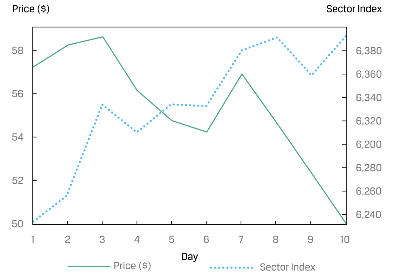
Line Chart
- Line Chat
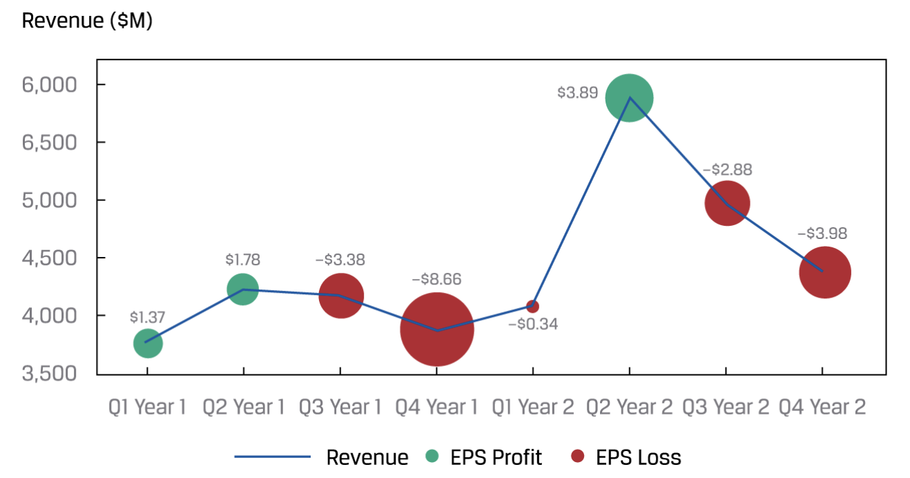
- Bubble line chart
“We can replace the data points with varying-sized bubbles to represent a third dimension of the data. Moreover, these bubbles may even be color-coded to present additional information. This version of a line chart is called a bubble line chart.”
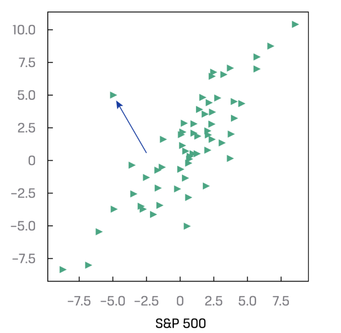
Scatter Plot 散点图
- “A scatter plot is a type of graph for visualizing the joint variation in two numerical variables.It is a useful tool for displaying and understanding potential **relationships between the variables.**”
- A scattoer plot matrix is a useful tool for organizing scatter plots between pairs of variables.
Heat map 热力图
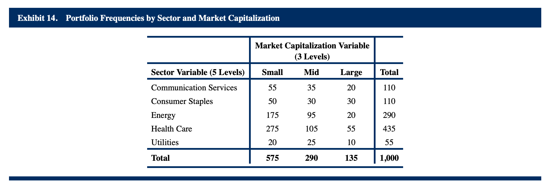
“A heat map is a type of graphic that organizes and summarizes data in a tabular format and represents them using a color spectrum. For example, given a portfolio, we can create a contingency table that summarizes the joint frequencies of the stock holdings by sector and by level of market capitalization.”
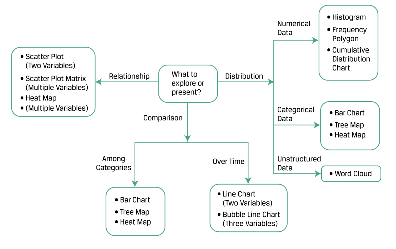
如何选择数据可视化
